
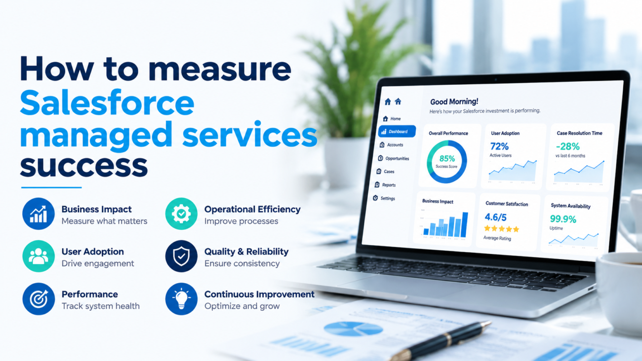
Most companies judge their Salesforce managed services provider on one number: did tickets close inside the agreed service window. That number matters, but it doesn’t tell you if the platform is actually getting better or paying off for the business. A provider can hit every service level target while adoption stalls and technical debt piles up underneath the report.
Real measurement means connecting three things that usually live in separate reports: how the platform performs, how people use it, and what it does for the business. When those move together, you’ve got proof the program is working. When they pull apart, you’ve caught a problem before it shows up in revenue.
Here’s a practical way to build that picture: how to set a baseline, pick the right mix of KPIs, build dashboards people actually use, calculate ROI without inflating it, and run reviews that lead to decisions instead of a status update. None of this needs a data team or new software. It just takes discipline about what you track, why you track it, and who’s on the hook when a number moves the wrong way.
TL:DR
The concern: Most leaders lean on SLA compliance and ticket counts to judge a managed services program, and those numbers hide the truth underneath them. A provider can meet every service window while adoption stalls, the same fixes keep recurring, data quality slips, and technical debt quietly grows. A green report can mask a platform that’s actually getting worse.
The fix: Build a scorecard across 6 areas: service delivery, platform health, delivery and enhancement, adoption, data quality, and cost. Set a baseline before you set any target, tie each metric back to a business outcome, give every KPI a named owner and a defined action, and review the trends on a fixed schedule instead of an ad hoc one.
The payoff: Done well, measurement turns managed services from a cost line into proof of value. Leading indicators catch problems while there’s still time to act, ROI gets calculated conservatively instead of generously, and reviews end in real decisions instead of a recap nobody remembers by Friday.
Start With a Maturity Check, Not a Scorecard
Before you pick metrics, it helps to know what level your program is actually operating at. Programs move through 5 stages. A reactive program just fixes what breaks, tracking ticket volume and response time from activity logs, ready to move on once incidents stabilize and stop recurring. A stabilized program adds consistent support and basic monitoring, watching SLA attainment, MTTR, and reopen rate, ready to advance once backlog and platform health hold steady.
A forward-looking program starts preventing issues and paying down technical debt, tracking change failure rate, backlog aging, and data quality through regular trend reviews, ready to move up once adoption and delivery become predictable. A business-aligned program ties its work to outcomes inside departments, adoption, outcome KPIs, ROI, with QBRs that bring stakeholders into the room and outcomes people actually trust.
The top tier, continuous value, shapes the roadmap itself, with value realized and roadmap progress as the headline metrics and planning shared with the business. Knowing where your program sits sets realistic expectations. Don’t grade a brand-new engagement against a level-5 program: give it time to climb.
Why the SLA Number Can Lie to You
Ticket counts are the most reported number in managed services, and the least useful on their own. A drop in tickets can mean the platform is stable and well run. It can also mean users gave up logging issues and started routing around the system with spreadsheets. Both cases produce the same number. Only one of them is good news.
SLAs have the same blind spot. They measure whether the provider responded and resolved inside an agreed window. Whether the fix held, or the same problem came back next month, is a separate question entirely, and most SLA reports never ask it. A provider can hit 100% attainment and still leave the underlying issue untouched.
Here’s what a green SLA report can hide:
- Tickets get resolved fast, then reopen a week later.
- Enhancements ship on schedule, and nobody adopts them.
- Releases come out frequently, each one low value.
- Uptime is high while the workflow underneath stays clunky.
- Reports get produced, and people quietly stop trusting the numbers.
- Licenses stay active while the features people paid for sit unused.
Keep the SLA, but pair it with experience measures (how support actually feels to the people using it), adoption measures (whether work is really happening inside Salesforce), outcome measures (what changed in the department), and value measures (whether the paid capability is doing anything). Some teams formalize this with experience-level agreements, or XLAs, which track outcomes and satisfaction instead of just response time.
Build a Baseline Before You Set a Target
You can’t prove improvement without knowing where you started. Before you agree to any target, pull historical numbers on incidents, resolution time, backlog, adoption, and data quality. Skip this step, and every future conversation about progress turns into a guess dressed up as a fact.
A Salesforce health check is a fast way to get there. It captures security posture, automation health, data quality, and integration status in a single pass instead of making you piece history together from old reports. Most teams that skip it end up reconstructing the same picture 6 months later, under worse conditions.
A baseline that holds up needs a few things:
- Pre-engagement performance recorded wherever the data exists, with gaps noted honestly rather than papered over.
- Fresh readings at 30, 60, and 90 days once the engagement starts, so early noise doesn’t skew the picture.
- Numbers segmented by department, since sales and service teams rarely generate the same support load.
- Comparisons that account for seasonality: quarter-end against quarter-end, not a quiet month against a launch month.
- Severity-aware measurement, because one critical outage matters more than dozens of small requests, and an average will bury that.
Be careful with outside benchmarks. They vary too much by industry, org size, and definition to treat as a promise. Your own past performance is the benchmark that actually means something. Where no credible outside number exists, build your target from your baseline and your priorities, not a generic industry figure.
The 6-Part Scorecard
No single metric proves a program works: read these together. Service delivery covers first-response time, MTTR, SLA attainment, reopen rate, escalation rate, first-contact resolution, and recurring incidents; a ticket that closes fast and reopens next week just delayed the problem. Platform health covers availability, transaction performance, failed automations, Flow and Apex errors, integration failures, API limits, storage, security findings, and technical debt.
Delivery and enhancement covers backlog size and age, throughput, lead time, cycle time, release frequency, scope predictability, defect leakage, and change failure rate, echoing the DORA framework’s balance of speed and stability. Adoption and experience covers active users, login frequency, feature adoption, record completion, training completion, and workarounds. A login proves someone opened Salesforce. It says nothing about whether the work got done.
Data quality covers duplicate rate, record completeness, invalid fields, accuracy, required-field compliance, matching quality, freshness, and consent accuracy; bad data quietly pushes people back to spreadsheets, which later shows up as falling adoption. Financial and efficiency covers cost per ticket, cost per active user, license utilization, unused licenses, automation hours saved, and cost of recurring incidents, the numbers finance actually recognizes.
Turn Activity Into a Story Finance Can Follow
The most common reporting mistake is presenting technical work with no line back to the business. Fix it by treating every metric as one link in a chain: activity leads to output, output leads to a better process, a better process leads to a department result, and that result leads to business impact.
Here’s what the chain looks like in practice, using a lead-routing fix as the example:
- Activity: the team fixes the lead assignment automation.
- Output: fewer routing failures and misassigned leads.
- Process improvement: faster, more reliable follow-up on new leads.
- Departmental outcome: better sales follow-up compliance.
- Business impact: more opportunities out of the same lead volume.
Reported this way, technical work has to earn its spot by pointing at something the business cares about. It also protects the provider’s good work from getting lost when someone only glances at the revenue chart. A quiet fix that prevents a future outage rarely shows up in a quarterly number, but it belongs in the story anyway.
Outcomes Look Different in Every Department
Operational metrics prove the platform is healthy. Outcome metrics prove it’s actually useful, and they vary by function. Managed services usually contributes to these results, it doesn’t cause them alone. Sales numbers depend on the market and the team as much as the CRM, so credit the program with its share of the result, and leave room for everything else that played a part.
Sales cares about lead response time, opportunity conversion, sales-cycle length, forecast accuracy, CRM activity completion, pipeline visibility, seller admin time, and revenue tied to improved process.
Marketing cares about lead routing accuracy, campaign attribution, handoff quality to sales, lead conversion, data completeness, automation reliability, and campaign speed.
Customer service cares about case resolution time, first-contact resolution, agent productivity, case backlog, escalation rate, satisfaction, self-service use, and service-level attainment.
Operations cares about manual steps removed, process completion time, error reduction, approval-cycle time, reporting speed, compliance, and cross-team visibility.
Watch for Warnings Before They Become Results
Leading indicators warn you before a business result moves. Lagging indicators confirm the damage after it’s already happened. You need both. Watch only lagging indicators, and you find out about problems from the revenue report, which is far too late to act. A leading indicator gives someone time to fix the cause before it turns into a cost.
| Leading indicator | What it eventually shows up as |
| Backlog aging climbing | Lost productivity |
| Failed automations rising | Missed sales opportunities |
| Training completion falling | Lower customer satisfaction |
| Technical debt growing | Compliance incidents |
| Data quality scores dropping | Higher support cost |
| Integration warnings rising | Revenue impact |
Build Dashboards for Whoever’s Reading Them
A dashboard that tries to serve everyone ends up serving nobody. An executive doesn’t want ticket-level detail, and a support lead doesn’t want a roadmap summary. Build a version for each audience, and match how often you review it to how fast the underlying number actually moves. A number that changes daily belongs nowhere near a quarterly deck.
Executives want business outcomes, ROI, major platform risks, adoption trends, cost efficiency, release value, roadmap progress, and the highest-priority issues, reviewed quarterly, kept to the handful of numbers that actually change a decision. The Salesforce program team wants backlog health, release performance, platform health, data quality, adoption, integration status, technical debt, and resource capacity, reviewed weekly to monthly.
Support operations wants ticket volume, severity mix, first-response time, resolution time, SLA attainment, reopen rate, escalations, and satisfaction, watched in real time or weekly. Each department wants its own outcome KPIs in its own language, reviewed monthly. Every KPI needs an owner, a target, a trend, and a defined next step if it moves the wrong way. A number with none of that is just decoration. Cut it.
Calculate ROI Without Flattering Yourself
ROI turns the program into a number leadership can weigh against other options. The formula itself is simple, and the hard part isn’t the math. It’s deciding honestly what counts as a real benefit, what doesn’t, and how much credit the program actually deserves before you plug anything in:
ROI = (Estimated financial benefit − Total managed services cost) ÷ Total managed services cost × 100
The discipline is in how you estimate the benefit. Count cost reduction, productivity gains, avoided downtime, less admin work, faster delivery, lower technical debt, better license use, fewer errors, and reduced risk. Use the low end of any range you’re unsure about, and only claim the share of the result a reasonable person would credit to the program.
Some benefits won’t reduce to a clean dollar figure: reduced risk, better decisions from data people actually trust, leadership time freed up. Record these as qualitative wins instead of forcing a number that won’t hold up. Whatever you calculate, review it on a fixed cadence. A quarterly business review is exactly the forum for it.
The Formulas and a Sample Scorecard
Define each formula the same way every time so the numbers stay comparable across reviews.
- SLA attainment rate = (tickets resolved within SLA ÷ total tickets resolved) x 100
- Ticket reopen rate = (reopened tickets ÷ total resolved tickets) x 100
- First-contact resolution rate = (cases resolved on first contact ÷ total cases) x 100
- Backlog aging = average age in days of open backlog items, by priority
- User adoption rate = (users performing the target action ÷ expected users) x 100
- Duplicate record rate = (duplicate records ÷ total records) x 100
- License utilization rate = (active licenses assigned ÷ purchased licenses) x 100
- Change success rate = (successful changes ÷ total changes deployed) x 100
- Cost per ticket = total support cost for the period ÷ tickets resolved
- Automation time saved = (minutes per task before minus after) x task volume ÷ 60, in hours
- ROI = (estimated financial benefit − total cost) ÷ total cost x 100
A scorecard should show each KPI with its category, definition, calculation, data source, target direction, review cadence, and owner. That last column matters more than it sounds. A KPI with nobody’s name next to it doesn’t get acted on, and a KPI nobody acts on isn’t really being tracked at all.
Governance Is What Makes the Dashboard Matter
A dashboard only creates value if it changes what someone does next. Governance is the mechanism for that: assign an owner to every KPI, agree on a cadence, and treat the quarterly business review as a place decisions get made, not a place slides get read out loud. A QBR worth attending covers:
- KPI trends against baseline and target
- SLA and support performance
- Root cause of recurring issues
- Release outcomes and value delivered
- Adoption and data-quality trends
- License utilization and cost
- Security and compliance status
- Roadmap progress
- ROI realized this quarter
- Agreed owners for next quarter’s priorities
Before you trust a provider’s numbers, ask a few direct questions:
- Do resolved issues stay resolved?
- Are enhancements actually adopted, not just shipped?
- Is technical debt trending down?
- Do reports connect activity to a business result?
- Can you check their numbers against your own systems?
- Do reviews end in a decision and a plan?
A handful of habits sink most measurement programs:
- Watching ticket volume alone.
- Holding every severity to the same target.
- Reporting averages that bury serious incidents.
- Counting logins as adoption.
- Reporting output with no line to business impact.
- Ignoring data quality until nobody trusts the dashboard.
- Skipping the baseline, then arguing about improvement.
- Tracking too many KPIs with no clear owner.
- Reviewing dashboards without deciding anything.
- Treating provider-reported numbers as the only source of truth.
- Ignoring how stakeholders actually feel about the platform.
- Crediting every business win to Salesforce alone.
- Cutting cost short-term at the expense of long-term platform health.
What This Actually Catches, in Practice
A services team reports 98% SLA attainment every month for months running. Leadership assumes the program is healthy, because the number never wavers and nobody on the account has raised a flag or asked a harder question about what sits underneath it.
Underneath that number, the same 3 integrations fail every week, users keep a shadow spreadsheet running in parallel, and adoption of a new feature sits near zero. None of that shows up anywhere on the monthly report, because nobody’s tracking it yet.
Once the team adds recurring-incident rate, integration-failure count, and feature adoption to the scorecard, the pattern surfaces. The integrations get a permanent fix, the spreadsheet disappears, and adoption climbs. The SLA number barely moves through any of this, but the program clearly gets better. It held steady the entire time. It just never covered the parts that mattered here.
A 90-Day Plan to Get This Running
In the first 30 days, baseline the platform. Capture incidents, backlog, adoption, and data quality, and agree on KPI definitions and owners before anything else starts. Skipping this step just pushes the same argument to month 3, with less patience left to have it.
Between day 31 and day 60, stand up dashboards for each audience and set target directions from the baseline you just built. Start weekly support and platform reviews, even if the data is still rough around the edges and nobody’s fully comfortable with the numbers yet.
From day 61 to day 90, add the business outcome and adoption metrics. Run the first full review, connect activity to outcomes, and set priorities for next quarter. By now the scorecard should be answering real questions, not just filling a slide nobody reads twice.
The Bottom Line
A green SLA report proves a provider answers fast. Nothing more. The programs that actually earn their budget connect platform health, adoption, delivery performance, cost, and department outcomes into one picture instead of five separate ones nobody bothers to compare.
That picture rests on a real baseline, a workable set of KPIs, a named owner for each one, dashboards built for the person reading them, and reviews that end in a decision. None of it is complicated. Most of it just never gets built, because nobody owns the follow-through.
Start where you are. Pick a baseline, pick the handful of KPIs tied to what you actually care about, and review them on a fixed schedule. Measured this way, managed services stops being a line item and starts being proof the platform is worth what you’re paying for it.
Frequently Asked Questions
How soon can you judge results?
Give early service stability 30 to 60 days. Wait closer to 90 days before judging bigger trends. Adoption, data quality, technical debt, and business outcomes usually need several reporting cycles before the movement means anything.
Should KPIs be written into the contract?
Yes. The agreement should spell out priority levels, how each number gets calculated, data sources, reporting frequency, ownership, exclusions, and what happens when something’s missed. Clear definitions up front prevent arguments later.
How many KPIs is too many?
Keep a wider library for reference, but put only 8 to 12 decision-ready KPIs on the main scorecard. More than that dilutes attention and makes it easier for a weak area to hide.
What about multiple clouds or business units?
Use shared measures for reliability, cost, security, and delivery across the board, then add outcomes specific to each cloud or department. Segment by business unit, region, and user group so one strong area can’t mask a weak one elsewhere.
Does a small org need the same approach?
No, it needs a lighter version, with 5 to 8 measures covering support quality, system stability, adoption, data accuracy, delivery speed, and cost, tracked with simple reports instead of a governance structure built for an enterprise.
What happens to the baseline after a major release or reorg?
Mark the change date, keep the old baseline for reference, and start a fresh comparison period. Don’t compare results directly across that line unless the definitions, users, and processes stay the same on both sides.
How do you compare 2 providers fairly?
Use identical definitions, severity rules, service scope, and time periods. Compare resolution quality, prevention, delivery reliability, and outcomes, rather than hourly rate or how fast tickets close.
What proof should back a claimed cost saving?
Ask for the source reports, the calculation logic, the assumptions, and evidence from your own systems, not just the provider’s. Savings should be reproducible and separated from anything caused by unrelated business changes.
How do you measure prevention when nothing goes wrong?
Track the preventive work itself: risks caught, automation failures fixed before they hit anyone, security issues closed, technical debt paid down, capacity problems avoided, and root causes eliminated. Pair it with an estimate of exposure avoided, and document your assumptions clearly.
Should employee feedback stay anonymous?
Usually yes. People are more honest when they’re not worried about criticizing a system or a decision someone above them made. Pair anonymous surveys with role-based interviews and actual usage data so opinions get checked against what’s really happening.
How do you separate the provider’s impact from market conditions?
Document the outside factors, compare similar teams and periods, and trace each claimed benefit through the full activity-to-outcome chain. Claim only the program’s share of the credit when staffing, demand, or process changes play a role too.
What happens when metrics keep missing target?
Require a corrective action plan with a root cause, a named owner, a deadline, and a way to check whether it worked. Repeated misses should trigger a real review of scope, staffing, or process, not another explanation.
How does AI or Agentforce work fit into this?
Measure more than whether it’s online. Track answer accuracy, escalation quality, task completion, incorrect or unsafe outputs, how often a human overrides it, adoption, response time, and business value. What counts as good performance depends on the use case.
How often should KPI definitions get revisited?
At least once a year, and any time scope, architecture, priorities, or reporting systems change enough to matter. Targets can shift quarterly. Just don’t shift them only to hide a bad trend.
How do you stop vanity metrics from creeping in?
Insist on transparent formulas, direct access to the source data, consistent definitions, trend history, and segmented results you can check against your own systems. If a metric doesn’t connect to a decision, an owner, or a business outcome, it’s probably just there to look good.
